Component Builder - Defining your Email Design System
What is an Email Design System?
In EmailShepherd, an Email Design System (EDS) is a collection of components that defines how your drag-and-drop email editor works.
Within your EDS, you:
- Define reusable components that can be dragged and dropped into emails.
- Specify editable fields that people using the email editor can customize (text, images, colors, etc.).
- Write the HTML structure that determines how each component is rendered in emails.
This ensures brand consistency, makes emails easier to manage, and allows marketers to build emails without touching code.
What is Component Builder?
The Component Builder is a development tool that lets you build, preview, and validate your Email Design System (EDS) in real time.
Getting Started with Component Builder
Create a New Email Design System
To start building your EDS:
- Navigate to
Email Design Systems>New Email Design System. - Enter a name and an optional description.
- Click Create, and you will be redirected to the Email Design System. From here you can enter Component Builder.
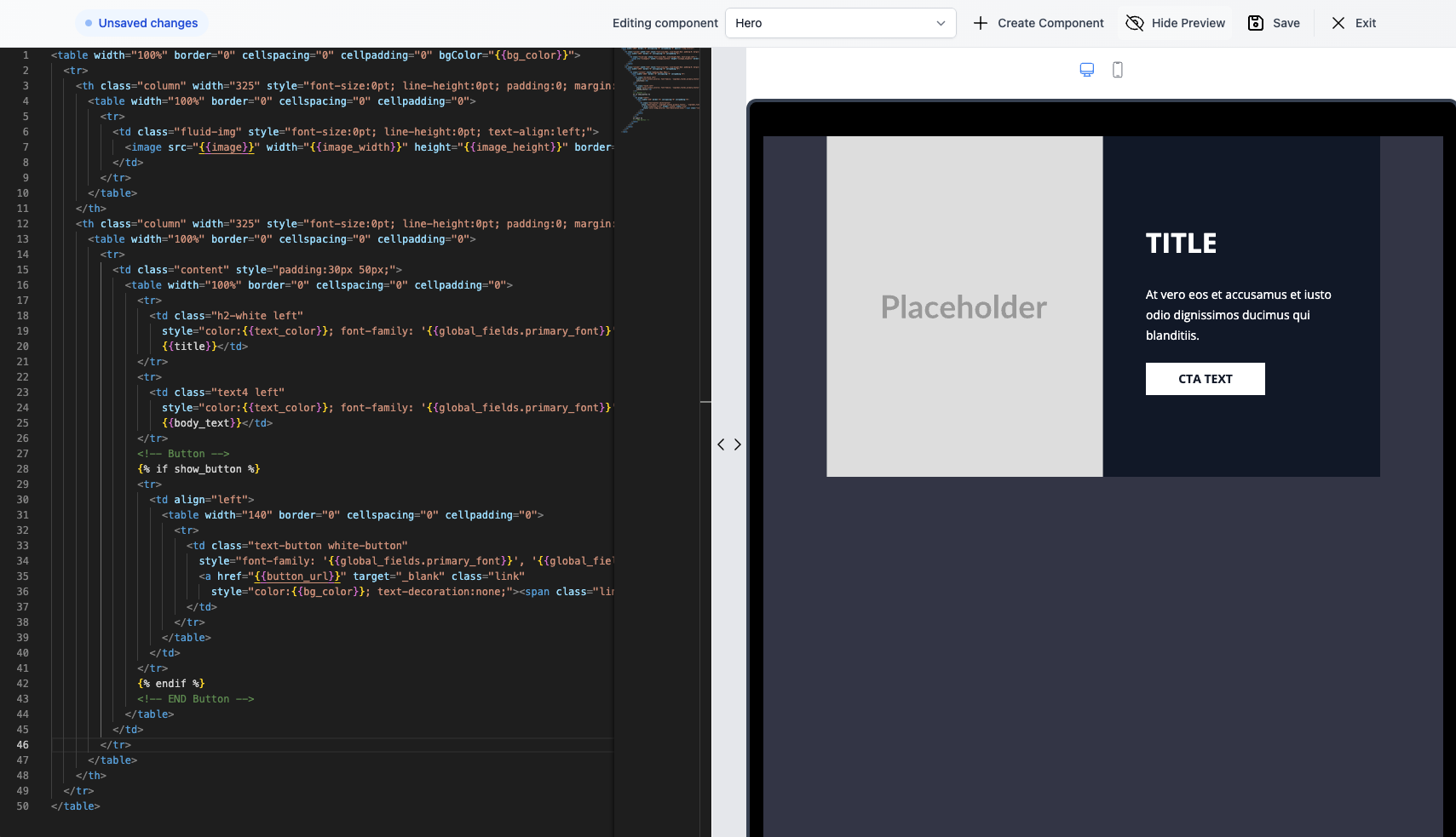
The left panel contains the code editor, where you’ll write the HTML for your components. On the right side of the screen you will see a metadata panel where you can see the fields you have defined and can add/edit/delete them.
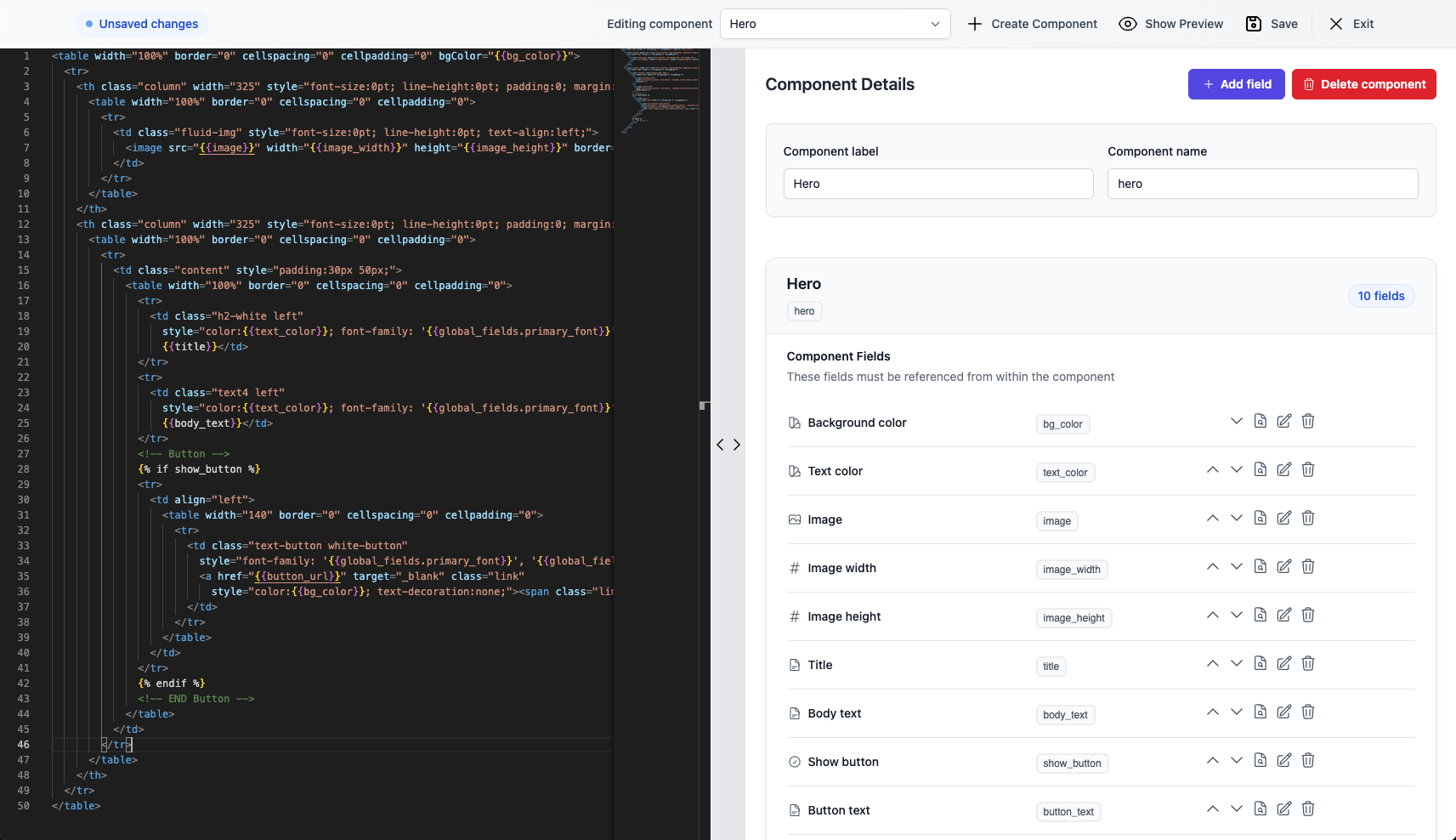
You can also switch to a live preview view, which will show you a live preview of your components as you make changes to them.
You can switch between components by clicking the dropdown in the control bar at the top of the screen.
If you have any unsaved changes, there will be an indicator in the top left of the screen.
Components
A component is what people can drag / drop into the email editor.
It is made up of a template, and editable field definitions. It requires a label and name to be set; the label is what will be displayed in the component list in the email editor.
Liquid support
The component template is HTML that supports Liquid syntax, which allows you to reference the component's editable fields.
Each field you define exposes a liquid variable, which you can reference in the template.
For example, if you have defined a text field with a liquid-variable of headline, you can reference it in the template with {{headline}}:
<table>
  <tr>
    <td>
      <p>{{headline}}</p>
    </td>
  </tr>
</table>
Liquid is a powerful templating engine which will allow you to do more complex things, such as using Liquid filters, loops, and conditionals.
Filters example
Fields:
| label | liquid variable | type |
|---|---|---|
| Headline | headline | text |
<!-- To ensure the title is capitalized -->
<p>{{headline | capitalize}}</p>
Loops example
Fields:
| label | liquid variable | type |
|---|---|---|
| Categories | comma_separated_categories | text |
<!-- To loop through an array of items -->
<table>
  {% assign categories = comma_separated_categories | split: ',' %}
  {% for category in categories %}
    <tr>
      <td>{{category}}</td>
    </tr>
  {% endfor %}
</table>
Conditionals example
Fields:
| label | liquid variable | type |
|---|---|---|
| Title | title | text |
| Body text | body_text | text |
| CTA text | cta_text | text |
| Show CTA | show_cta | boolean |
<!-- for variations of your component, e.g. an optional CTA -->
 <!-- assumes you have defined a title text field, a body_text text field, a cta_text text field, and a show_cta boolean field -->
<table>
  <tr>
    <td>
      <p>{{title}}</p>
      <p>{{body_text}}</p>
      {% if show_cta %}
        <a href="https://example.com">{{cta_text}}</a>
      {% endif %}
    </td>
  </tr>
</table>
It is important to understand that each template is rendered as its own Liquid template. This means that you can only reference fields that are defined within the same component, or global fields.
If you delete a component, any emails that use that component will no longer render it. Emails can only use components that exist in the Email Design System. This also applies if you make a change to a component; any emails that use that component will instantly have the updated component applied to them.
The Container Component
Each Email Design System has a container component. This is a special component that is used as the shell for your email.
The Container Component's template must include the {{children}} placeholder. This designates the drop zone — the area in the editor UI where users can drag and drop your components.
Fields defined in the Container Component are global fields. That means that:
- they must be referenced using the
global_fieldsprefix e.g.{{global_fields.your_field_name}} - they will be accessible to all other components in the Email Design System
In the email editor, container component fields (global fields) can be edited in the 'Global fields' section of the email editor.
An example of a basic Container Component's template:
<!DOCTYPE html>
<html>
  <head>
    <meta http-equiv="Content-Type" content="text/html charset=UTF-8" />
    <meta charset="utf-8">
    <meta name="viewport" content="width=device-width, initial-scale=1, user-scalable=yes">
    <meta name="x-apple-disable-message-reformatting">

    <title>{{render_context.email.content.subject}}</title>

    <style type="text/css">
      /* Add your css */
    </style>
  </head>
  <body style="background-color: {{global_fields.email_background_color}}">
    <div style="display:none">
      {{render_context.email.content.preheader}}
    </div>

    <table>
      <tr>
        <td>
          <!-- Don't remove the children placeholder this is where components will be inserted -->
          {{children}}
        </td>
      </tr>
    </table>
  </body>
</html>
Fields
A field corresponds to a property of a component that can be edited in the email editor UI. There are several types of fields, each of which will render a corresponding UI element in the UI editor.
You can create, edit or delete fields in the Component Builder UI.
Each field requires:
label- the label of the field, displayed in the UI editortype- the type of the field, e.g.text,number,boolean,color,enum,image,rich_text,urlliquid-variable- the Liquid variable that can be referenced in the component's HTML template
Each field also has some optional attributes:
hint- a tooltip displayed in the UI editorvisible-if- see the field visibility section
Some specific fields will also have additional attributes they require.
Each field type shows up as a specific kind of input in the editor — like a text box, toggle, or color picker.
When you make changes to your components, keep in mind that field values for existing emails are stored against the liquid-variable. So if you remove, or rename a field's liquid-variable, the value saved against it will be lost. If this happens unintentionally you can always re-add the field with the same liquid-variable and the value will be re-instated.
Field types
text Text field
The text field displays a simple text input field in the email editor.
Fields:
| label | liquid variable | type |
|---|---|---|
| CTA text | cta_text | text |
<table>
  <tr>
    <td>
      <a href="https://example.com">{{cta_text}}</a>
    </td>
  </tr>
</table>
number Number field
The number field displays a number input field in the email editor.
Its default-value must be a valid integer or float.
Fields:
| label | liquid variable | type |
|---|---|---|
| Image width | img_width | number |
<table>
  <tr>
    <td>
      <img src="https://example.com/example.png" width="{{img_width}}" style="display: block; width: {{img_width}}" />
    </td>
  </tr>
</table>
boolean Boolean field
The boolean field displays a toggle in the email editor.
Its default-value must be either true or false.

Fields:
| label | liquid variable | type |
|---|---|---|
| Show image | show_image | boolean |
<table>
  <tr>
    <td>
      {% if show_image %}
        <img src="https://example.com/example.png" />
      {% endif %}
    </td>
  </tr>
</table>
color Color field
The color field displays a color picker in the email editor.
Its default-value must be a valid HEX color value.
Fields:
| label | liquid variable | type |
|---|---|---|
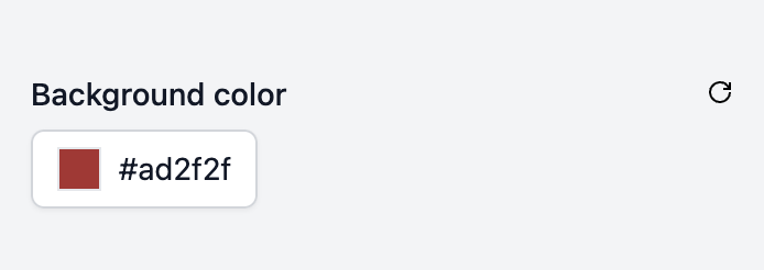
| Background color | bg_color | color |
<table style="background-color: {{bg_color}}">
  <tr>
    <td>
      <p>Some content</p>
    </td>
  </tr>
</table>
enum Enum field
The enum field displays a dropdown menu with a list of predefined options in the email editor.
Its default-value must be one of the defined options.
Fields:
| label | liquid variable | type | options |
|---|---|---|---|
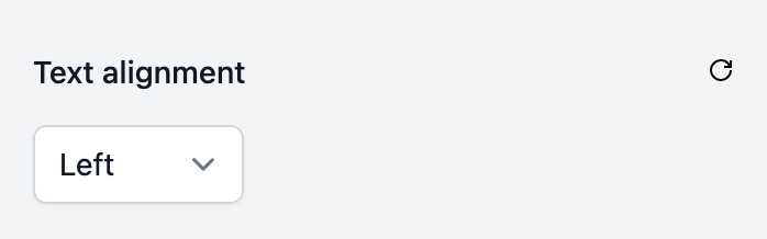
| Text alignment | text_alignment | enum | left, center, right |
<table style="text-align: {{text_alignment}}">
  <tr>
    <td>
      <p>Some content</p>
    </td>
  </tr>
</table>
image Image field
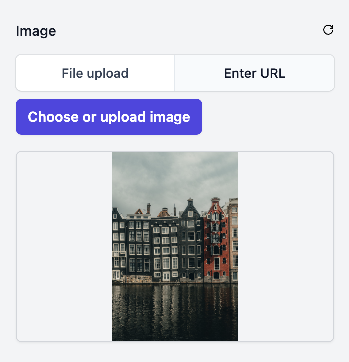
The image field displays a choice between uploading an image to the image library or enter a URL directly. You will generally want to use this as the src attribute of an <img> tag.
Fields:
| label | liquid variable | type |
|---|---|---|
| Image URL | img_url | image |
<table>
  <tr>
    <td>
      <img src="{{img_url}}" />
    </td>
  </tr>
</table>
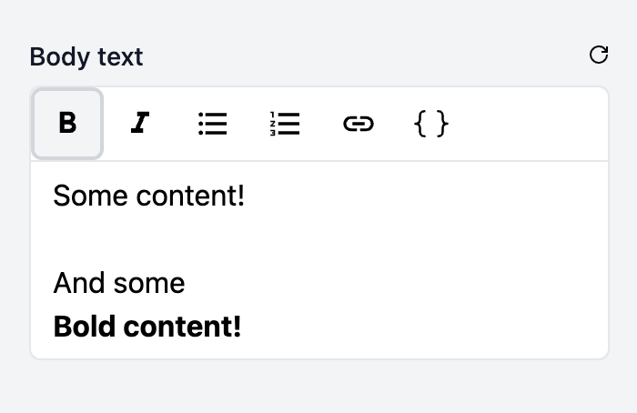
rich_text Rich text field
The rich_text field displays a rich text editor in the email editor.
Fields:
| label | liquid variable | type |
|---|---|---|
| Text | text | rich_text |
<table>
  <tr>
    <td>
      {{text}}
    </td>
  </tr>
</table>
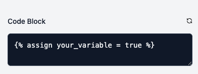
code Code field
The code field displays a code editor in the email editor.
Fields:
| label | liquid variable | type |
|---|---|---|
| Code Block | code_block | code |
<table>
  <tr>
    <td>
      {{code_block}}
    </td>
  </tr>
</table>
Stylng rich text fields
You may wish to style the rich text fields in a certain way. To do this you can target as below:
| description | tag | css class |
|---|---|---|
| Paragraph | <p> | es-paragraph |
| Bold | <strong> | es-bold |
| Italic | <em> | es-italic |
| Bullet list | <ul> | es-bullet-list |
| Ordered list | <ol> | es-ordered-list |
| List item | <li> | es-list-item |
| Link | <a> | es-link |
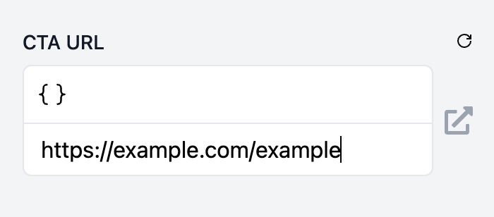
url URL field
The url field displays a text input field in the email editor with a button to preview the URL.
Fields:
| label | liquid variable | type |
|---|---|---|
| CTA URL | cta_url | url |
<table>
  <tr>
    <td>
      <a href="{{cta_url}}">Click here</a>
    </td>
  </tr>
</table>
Field visibility
There are times where you may want to hide a field in the email editor. A simple example of this would be if one of your components has an optional image; you might have an image_src field, and a show_image boolean field. But if show_image is false, you probably don't want to show the image_src field, e.g.:
Fields:
| label | liquid variable | type | visible-if |
|---|---|---|---|
| Image | image_src | url | show_image == true |
| Show image? | show_image | boolean |
<table>
  {% if show_image %}
  <tr>
    <td>
      <img src="{{image_src}}" />
    </td>
  </tr>
  {% endif %}
</table>
This can be achieved using the visible-if attribute of a field.
The visible-if attribute expects a valid Liquid expression. Just the expression part is needed, without the {% %} tags e.g. showImage == true or simply showImage.
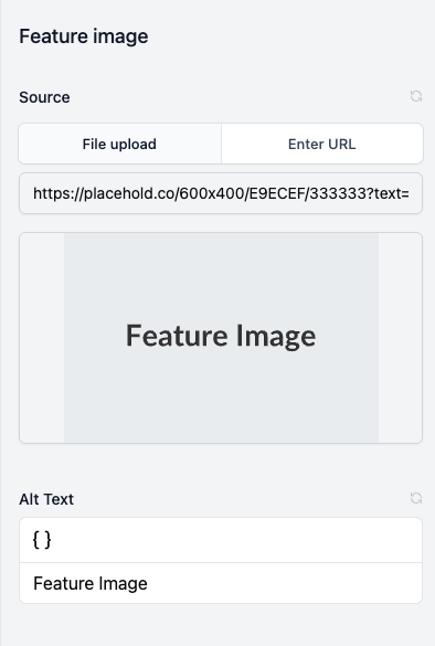
Field groups
You can use field groups to group together fields in the email editor. For example if you had a component featuring an image, you may choose to create a group called Feature image with an image field Source and a text field Alt Text.
Field validation rules
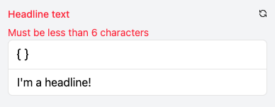
Validation rules act as guardrails for your email design system, helping content creators stay within brand guidelines and quality standards. By adding validation rules to fields, you can enforce requirements like minimum/maximum character counts, or preventing blank fields. When a field fails validation, the editor provides immediate visual feedback, making it easy for users to identify and fix issues.
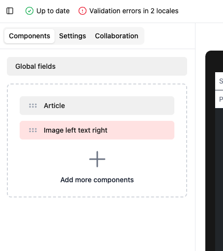
The image below shows an example of a field failing a validation rule:
There is also an indicator on the component itself:
Specific fields support different validation rules:
| Field type | Validation rule | Description |
|---|---|---|
text | Min Length | The minimum length of the text in the field. |
text | Max Length | The maximum length of the text in the field. |
text | Must Not Be Blank | The text must not be blank/empty. |
text | Must Not Be Default | The text cannot match the default value, it must be changed. |
number | Min | The minimum value of the number. |
number | Max | The maximum value of the number. |
image | Must Not Be Blank | The image must not be blank/empty. |
image | Must Not Be Default | The image cannot match the default value, it must be changed. |
code | Must Not Be Blank | The code must not be blank/empty. |
code | Must Not Be Default | The code cannot match the default value, it must be changed. |
url | Must Not Be Blank | The URL must not be blank/empty. |
url | Must Not Be Default | The URL cannot match the default value, it must be changed. |
url | Must Be a Valid URL | The URL must be a valid URL. |
rich_text | Min Content Length | The minimum length of the rich text in the field. Note: the way this is calculated is with the HTML tags stripped from the value. |
rich_text | Max Content Length | The maximum length of the rich text in the field. Note: the way this is calculated is with the HTML tags stripped from the value. |
rich_text | Must Not Be Blank | The rich text must not be blank/empty. |
rich_text | Must Not Be Default | The rich text cannot match the default value, it must be changed. |
Render context
On every render EmailShepherd provides a render_context Liquid object whose properties can be referenced from within your EDS.
Example render context object
{
  "render_context": {
    "email": {
      "id": 1,
      "name": "My email",
      "locale": "en-US",
      "content": {
        "subject": "Hello, world!",
        "preheader": "This is a test email"
      }
    },
    "project": {
      "id": 1,
      "name": "My project"
    },
    "email_design_system": {
      "id": 1,
      "name": "My email design system"
    },
    "brand_profile": {
      "id": 1,
      "name": "My brand profile"
    },
    "component_instance": {
      "id": "abcd-1234-5678-9012",
      "component_id": 1,
      "name": "My component instance",
      "component_name": "My component"
    },
    "connector": {
      "id": 1,
      "name": "My connector",
      "type": "salesforce_marketing_cloud"
    }
  }
}
E.g. to reference the subject property from within your EDS, you can use {{render_context.email.content.subject}}:
<html>
  <head>
    <title>{{render_context.email.content.subject}}</title>
    ...
  </head>
  ...
</html>